// Ourglass // Nav
// Highlight Features
// Misc
ourglass
ourglass
ourglass
ourglass
ourglass
ourglass
ourglass
ourglass
Project
//
Laying the social foundation for a Bitcoin app
A short video social app designed end to end, from wireframes to a tested build. The wallet was the destination. The habit came first.
// Role
Design lead, three designers
// timeline
2022 to 2023
// Status
[Discontinued]
Discontinued after TestFlight
// platform
iOS & Android
// team
Three designers, developers, QA
Ourglass was a short video social app, built as the first step toward a Bitcoin wallet. I designed it end to end, first alone and then leading three designers, from wireframes to TestFlight.
Three things carried the work: behavior specified and approved before it was built, a community feature called Spaces, and a design system with its own illustrations and motion.
Alpha Stage
A social app first, Bitcoin later
Ourglass started as wireframes, and most of that stage was trying ideas on: home screen widgets that reordered the social parts of the app, browsing split by media type, different shapes for messaging. Some of it survived, some of it did not.
What had to be right was the base: a feed, the people you follow, media worth staying for, messaging. The wallet was always the destination, but the habit came first.


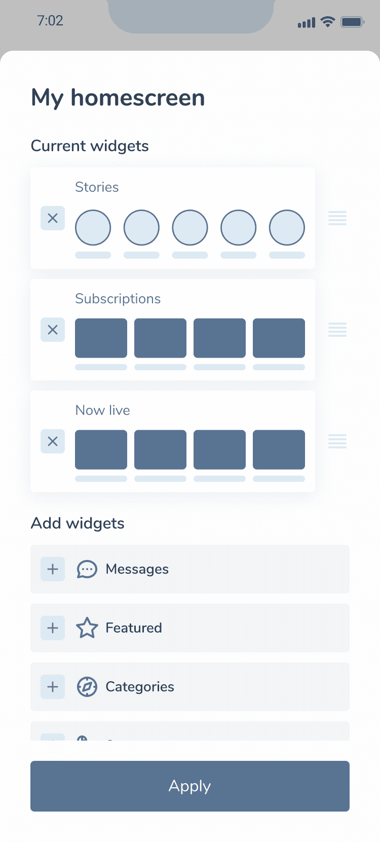
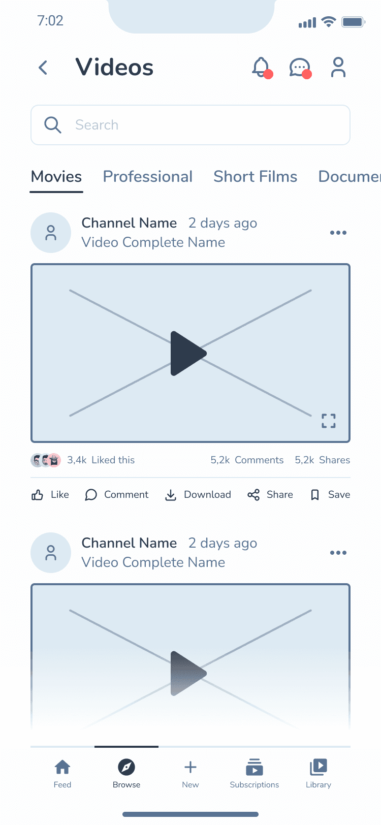

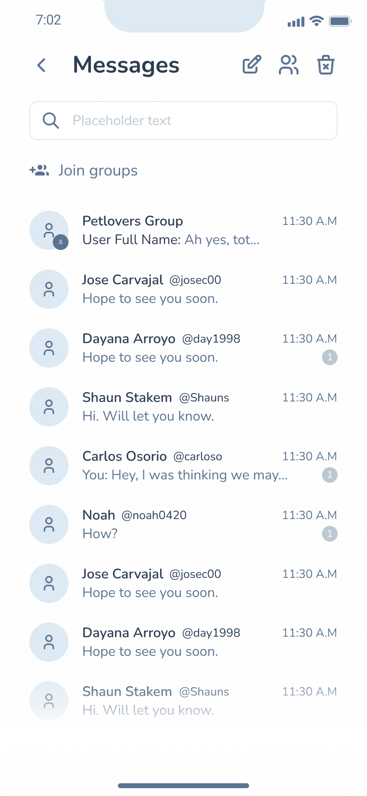
The look took the same treatment: palettes, card shapes, corner radius, how dark the dark should go. These are three of the drafts before it settled.


Spaces
Communities you can find, join and switch between
Spaces were communities inside the app, and the feature that drew the most interest. The idea was to combine the structure of a Discord server, with members, roles and rooms, with the open conversation of Reddit, all inside the main social app.
It starts at the Space hub, the home for every Space you own or belong to, and where new ones are made.
Each Space has its own homepage, and what it shows depends on who is looking. A public Space shows its feed to anyone. A private one shows only its name, its size and a way to ask in. Members see the feed, with options that match their role.


The second version brought Spaces onto the home screen. A row of Spaces sits above the feed, and choosing one narrows the feed to that Space, like moving from the Reddit homepage into a single subreddit. Pull the row down for the full panel: invitations, finding new Spaces, search, and a filter for the Spaces you belong to or own.
Pins set the front of the row. In edit mode you pin and unpin, and the row follows the order you pinned in.
Group Calls
Group calls that teach themselves
Group calls started from a group chat. The controls that matter most are gestures, which nothing on screen shows, so the first time someone joins a call, two short tutorials teach them: swipe to see more people, and press and hold a person to pin, message or mute them.
Login & Face Verification
Secure sign in, designed for every way it can fail
Sign in had to cover every failure, each drawn and labeled: a failed login, a missing or invalid field, and a real account still waiting in the beta queue. Face ID got the same care, with a plain message and a second try when the phone cannot recognize a face.
Proof of liveliness was the alternative to Face ID, and a second layer of security for the Bitcoin wallet to come. It asks for a photo with a set expression, says plainly when the face is out of frame, checks the photo, then confirms with a code sent by text.
Design System
A system built from scratch
All of it sat on a component library of our own: semantic color tokens, a spacing and radius scale, and standard iOS elements documented next to the custom ones. Components were built as full sets of variants, such as buttons in ten styles, five states and three sizes, and inputs with every state including search.
An illustration set of thirty one pieces, all built on the hourglass mark, covered empty states, verification, security, permissions, maintenance and the waitlist, so the moments with nothing to show still looked like the product.


Behavior Specs
Deciding behavior before pixels
Behavior was its own deliverable. Each rule got a sheet: the condition that triggers it, drawn on more than one kind of content so the edge cases show, versioned and approved.
Autoplay decided which video plays by how much of it is on screen. Other sheets set the order of the social bar, and what a swipe means in fullscreen when the same gesture could mean two things.
The sheets let developers answer their own questions mid build, and review with developers and QA kept changing the designs as it went.
Motion Design
Motion for loading, learning and rewards
Motion was designed in After Effects, exported as Lottie and built with the developers. Each piece had a job: telling people the app was working, confirming a tap, rewarding progress, or teaching a gesture.
Everyday Flows
Smaller flows, finished to the same standard
Flows you have seen on other platforms: friend requests, the inbox, the music player, the profile. Nothing new to invent, so the work was making them feel like the rest of the app. The profile coin was the first piece of the gamification layer.